How simplifying our homepage helped increase trial signups by 84%
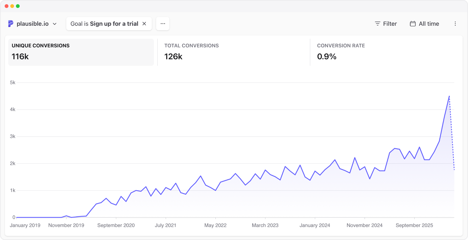
April 2026 was our best month ever. We added more new paying subscribers than in any other month in our seven-year history. For three months running, from February through April, we set new all-time records for both trial signups and new paying customers.
We didn’t launch a new feature. We didn’t run any paid ads. We didn’t get a viral blog post or a lucky mention on Hacker News. What happened was much less dramatic than that. In late January, we spent a few days editing our homepage.
We moved some sections around, cut some text and changed the button labels. We expected it to help a little but we didn’t expect it to have this kind of impact.
Here’s what we changed and what the data showed.
What was wrong with our homepage
Our homepage had been roughly the same for a long time. It was working well enough. We were growing steadily with it. But when we looked at it with fresh eyes in January, we realized we were making visitors work too hard to understand what Plausible does.
The homepage still matters a lot for us. From January through April, it was the biggest entry point for non-logged-in visitors, accounting for roughly 43% of entrances. So even small improvements there can affect a large part of the signup journey.
The page opened with our hero section and a screenshot of the dashboard. That part was fine. But right after that, visitors landed on a wall of text. Six subsections of long-form prose about our features, our philosophy, our approach to team sharing and enterprise plans. Hundreds of words before you reached the scannable feature grid.
The feature grid, the part where you can quickly see what Plausible actually does, was buried below all that text. Then came testimonials, then pricing.
If you wanted to quickly figure out whether Plausible was worth trying, you had to scroll through an essay first. That’s not how people browse the web. People scan. They jump around and make snap judgments.
We also looked at our call-to-action buttons. They said “Get started” and “Live demo.” Generic and vague.
The changes we made
Most of the changes were live by the end of January, with a few smaller edits following in early February. You can see them all in our website repo. None of them involved a designer, a new layout or any visual changes. The colors, fonts, images and components are the same as before.
Here’s what we did:
Flipped the page structure
This was the biggest change. We moved the feature grid up so it appears right after the hero section, before any long-form text.
The old order was: hero, long prose (six sections), feature grid, testimonials, pricing.
The new order is: hero, feature grid, testimonials, shorter prose (three sections), pricing.
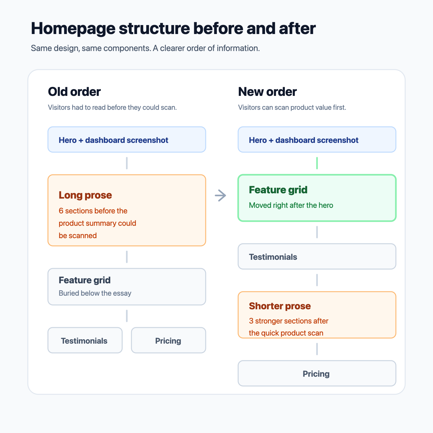
Now a visitor can scan our eight key features within seconds of scrolling down. No reading required to understand what we do.
Changed the CTA wording
“Get started” became “Start free trial.” “Live demo” became “View live demo.”
“Get started” is probably the most overused button label on the web. It tells you nothing about what happens when you click. Will it cost money? Is this a demo, a signup or a purchase? “Start free trial” answers the important part: this is a trial, not a commitment.
It looked like a tiny copy change, but it changed what the button promised.
Cut the prose in half
The old page had six subsections of text: simple analytics, lightweight script, privacy and GDPR, goals and revenue tracking, team sharing and dashboard sharing, and a smooth transition from Google Analytics. Plus a paragraph about enterprise plans.
We cut it down to three: simple analytics, lightweight script and privacy. These are our strongest differentiators and the things people care about most when evaluating Plausible as their Google Analytics alternative.
We didn’t remove all the prose. Plausible is not just a list of features, and we still want the homepage to explain why we exist. Our philosophy around privacy, simplicity and independence is a big part of what has kept us differentiated in the analytics market.
The change was not to hide that story. It was to stop making every visitor read it before they could quickly understand the product.
The removed sections were either already covered by the feature grid above or only relevant to a small subset of visitors. Less text between understanding the product and seeing the pricing means fewer opportunities to lose people.
Refreshed the testimonials
Our testimonials section used to show a Twitter icon next to each person with their Twitter handle as the identifier. Twitter had changed, and the icon made the section feel dated.
We removed the icon and replaced the handles with people’s real titles and companies. So “@dhh” became “Co-founder and CTO at 37signals” and “@JohnONolan” became “Founder and CEO at Ghost.” When someone scrolling through testimonials sees the company and role rather than a social handle, it’s immediately more credible and easier to relate to.
We also added a new testimonial from Clem Delangue, co-founder and CEO at Hugging Face.
What happened next
We didn’t run an A/B test, so this is not a clean experiment. We can’t prove that every part of the lift came from the homepage changes. But the timing, the size of the increase and the lack of a traffic spike made the change hard to ignore.
Despite being the shortest month of the year and having fewer visitors than January, February set a new all-time record for trial signups. Then March broke that record. Then April broke it again.
Looking only at non-logged-in visitors, trial signups increased 84% from January to April, while traffic increased by only about 2%.
| Month | Trial signups | Register page conversion | Visitor-to-trial rate |
|---|---|---|---|
| January | 2,423 | 38% | 2.65% |
| February | 2,656 | 48.8% | 3.09% |
| March | 3,608 | 52.8% | 3.64% |
| April | 4,464 | 57.3% | 4.80% |
February, March and April were three consecutive all-time records for trial signups in Plausible’s history.
The register page converted better too. More people who reached it completed a trial signup, and the broader visitor-to-trial rate rose from 2.65% in January to 4.80% in April.
The more specific button wording may have helped here. “Start free trial” likely set clearer expectations before people clicked, so visitors who reached the register page were more likely to understand exactly what they were doing.
The paid customer data followed with the usual delay from our 30-day trial. February was also a new record month for paying subscribers, though that month still included many people who had started trials before the homepage changes. March and April were the cleaner signal:
- February: 652 new paying subscribers
- March: 953
- April: 1,156
By April, a much larger share of new paying customers had entered through the updated homepage experience.
And this happened while churn stayed broadly stable. We weren’t just attracting more people, we were still attracting the right people.
The revenue data told the same story. April was our best month ever for new MRR and new customers, while net new MRR was our third best month ever. This wasn’t existing customers expanding more than usual. The main change was that more new people started a trial and became paying customers.
The website traffic and trial signup numbers are visible to anyone in our live demo.
What we take from this
It reminds us of what we learned in the early days of Plausible. When we repositioned our homepage back in April 2020 to clearly explain what we do and how we compare to Google Analytics, that change in communication was what started our growth. The lesson then was the same as the lesson now: be obvious, be clear and don’t make people work to understand what you’re about.
If you’re running a company and haven’t taken a fresh look at your homepage in a while, it might be worth spending a few days on it. Not necessarily a redesign. Just look at the order of information, the words on your buttons and whether there’s text that could be cut without losing anything meaningful.
In hindsight, some of these changes feel obvious. But they weren’t obvious to us while we were deep in the product every day.
Part of what happened is probably inevitable for any product that survives long enough. Over time, you accumulate communication debt.
A new feature launches so you add a section about it. Enterprise customers ask questions so you add clarification copy. You enter a new market so you add messaging for a new audience. Each change makes sense in isolation.
For us, that meant adding more detail about team sharing, dashboard sharing, goals, revenue tracking, enterprise plans and the transition from Google Analytics. All useful things to explain somewhere. But over time, the homepage became the place where too many of those explanations lived.
After years of layering additions on top of additions, our homepage had slowly drifted away from its original purpose. It had become a collection of everything we wanted to say rather than the few things a visitor actually needed to understand.
Our homepage had been “good enough” for years. It had helped us reach more than 15,000 paying subscribers, so it didn’t feel broken. Nothing on the page was individually wrong. Almost every section had been added for a good reason. But together they created friction.
That’s probably true for a lot of mature products and companies. Complexity rarely arrives all at once. It accumulates a paragraph at a time.